Minimalist Web Design is one of those classic design trends that just keeps going. Minimalism is all over the web these days, because of Its lightweight layouts and low maintenance make it flexible for responsive design, and its natural elegance is sought by many brands and agencies but Minimalist Web Design is not a technique exclusive to web design. The world craves minimalism. So much so, that whichever aspect of our lives you look at, whether it is the lifestyles we lead, homes we live in, or the products we consume, minimalism is present in every facet. Even the smartphones in our pocket prove that minimalist design has more than caught on.
What is a Minimalist Web Design?
Minimalist is known as the art of less. In the web design, Minimalist is all about creating seamless user experiences without extraneous design elements that add distraction. For Example: If you’re trying to reach a mountain top, you need to be as light as possible. At the top, when it’s just you and your necessary gadgets, you’ll get the most space and the clearest view of the world. Minimalism helps you survive the journey with the fewest resources so you get the best experience. Minimalism can make your website look smart, intelligent, modern, effortless and capable of achieving much more with less. When distraction goes down, action, engagement and conversion goes way up.
Benefits of Minimalist Web Design | Why Minimalism?
Why is minimalist web design so popular? There are a series of benefits that this approach provides.
Focus on Content: In Web Design Content is King, and minimalist web design should honor the content. We confused with simplicity, the main rule of minimalist only includes those elements which are essential so users don’t need to spend extra time extracting essential information from tons of detail. This means that while minimalism is simple, simplicity, or using simple forms, does not necessarily translate to minimalism. In the world of design, minimalism is used to directly convey the message without the unnecessary elements which distracting of focus user.
Faster page loading speed:
Page loading speed is one of the most important factor for SEO. In fact, web pages that take below 3to5 seconds to load have a low bounce rate. With minimalist web design, there are fewer important items that can load on a web page which reduce page loading time. And when you have a website that loads faster on all devices, you have a strong foundation to rank higher on search results and among site visitors.
Better UX:
User experience is the visitor’s interpretation of how pleasing their experience is with your website. This is seen as the most important aspect of online marketing. Any large company has spent money to improving their user experience! In minimalist web design, fast loading page with to the point information gives a best user experience which means there are much more chances to convert visitor in customer. If the user is pleased with their 1st impression of your website, they are going to instantly believe your service is great and will be willing to forgive any mishaps in the future.
SEO Friendly:
Minimalist design is SE-friendly because it allows search engines to crawl through and understand the website’s content more easily. There’s not a lot of clutter on the front end or in the back, stored in code. Google has openly declared that they award websites with clean coding and that are optimized for mobile. (Faster page loading speed is part of SEO too.)
Responsive Design:
Because of less content and simple design, Minimalism helps create a design that works for all screen sizes. With the growing use of mobile devices, minimalism is a better solution for compatibility between screen sizes.
Easy maintenance:
The minimal approach design translates to a simpler design. This simpler design results in a cleaner web development. Traditional, heavy-duty websites with complex design and functionality are much harder to maintain. In addition to constant updates and plugins, you need to constantly work on UX and improving website security. One of the benefits of minimalist web design is that they are much easier to keep in check. Since they have fewer elements by nature, the upkeep is simpler and lighter. You end up saving time and energy.
Style Forever:
While web design tastes will change, minimalist design is not likely to look outdated for some time. You’re not using elements, animations or styles that are a hot fad; instead, you’re relying on sharp images and the right typography to convey your message.
How to Make Minimalist Website
We have checked benefits of using minimalist in website design now the question is How Make Minimalist Website? All designers have different interpretations of what minimal web design truly is, but most would agree that the purpose of an effective minimally designed web page is to layout the content in such a way that no single element distracts attention from the visual hierarchy. And the key to achieving minimal distraction is to initially have a well-structured backbone focused on the comparative space relation between the fundamental elements of the web page.
There no rules for How to Make Minimalist Website but below are few key practices that can help you create stunning minimalist website, application or other digital products.
Only Essentials Content and Features:
Minimalism is about removing all unnecessary elements and content. When designers want to create a truly minimalist web design, one of the first things they do is conduct a content and feature analysis. The goal of this activity is to prioritize all content and features, so they can identify what the essential components of the design are. Every item in a design, whether an image or copy, should have a purpose.
READ MORE
Layout Structure
Having a minimal design does not always imply a simple site structure. Oftentimes, dialing back the visual overload of a site means turning up the effort put into an intelligent layout. Visual hierarchy is the relationship between visual elements. Good visual hierarchy moves the visitor’s eye across the page and pulls attention to certain elements. Typography, photos, and colors should all work together to create a balance. Is your logo in a relevant location? Is your site navigation easy to find and convenient to use? These are huge questions that will make or break the functionality of your site without over-the-top graphics to back these important elements up.
Set Great Expectations With the Top Area of the Screen
Simplify (But Don’t Hide) the Navigation
Have a Single Focal Point Per Screen
White Space
White space (also called negative space) is the blank space, the empty space, between website elements. These elements typically are text, images, graphics, columns, typography, navigation menu and other elements. White space doesn’t need to be white, it may be any color. As per modern website design minimalism rule with a tide of purposeful white space. There are many benefits to using white space, but first and foremost, it improves the user experience and concentrates attention on webpage content and your product.
READ MORE
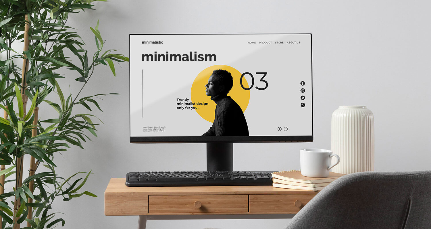
Hero Image | Hero Header
Minimalist website design can come across as emotionally distant when overdone. This is why a touch of contrast, such as oversized photos, add a bit of necessary balance. Hero images and headers are the most commonly used examples. Hero image refers to a very large banner image used in website design. A hero image often consists of image and big text in a creative way. Hero Image prominently placed on the top of the page in header section of a website. Because of its prominent place in the website, the hero image is the first visual element a visitor will see, when arriving on a website. So it’s must essential that you will include the most important content of website.
READ MORE
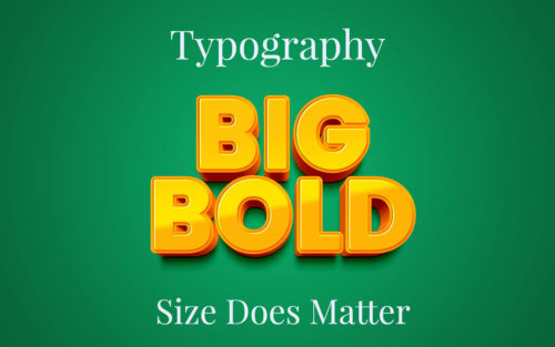
Typography
In the context of Minimalist Web Design digital design, sharp, clean and readable typography can contribute a lot to the consistency of this design. Web designer use oversized fonts with big, impactful visuals in order to create memorable first impressions to website visitors. In minimalism, bold headline fonts paired with smaller, legible body text makes a huge impact. When users visit a website, they want to learn what it’s all about. Typography adds a layer of life and meaning to your dynamic visuals and white space.
READ MORE
Colors:
The philosophy and practice of minimal digital design dictate that color should always assist the typography and imagery on the screen. Color also evokes emotion and helps both your design and copy engage with users on a deeper, visceral level. The colors you choose for your site should be as simple as your typography selection. Color can be used for various purposes. For example, color can be used as a background texture: The dark text contrasts with the neutral background, which guides the user to the important elements on the site.
READ MORE
Conclusion | Be a minimalism master!
Minimalist Web Design is more than just a style; it’s a philosophy. This philosophy helps designers embrace complexity and create more efficient products. But creating good minimalist design requires practice. To find success with your minimalist web design, you’ll need sharp vision, an open mind, and the courage to take up the journey from clutter to no-clutter. The principles that described above are the basic rules that you should take into account when creating your design but there are no such a rules for minimalist design. You need to understand content, list out most essential elements and find a creative way to present it.