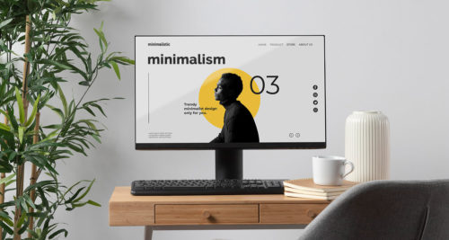
Use of font in website creatively can not only carry your message, but it’s also make a visual impact. Big & bold typography is the most obvious use of text as a primary web design element. This year, we’re seeing hero images with bold headlines that anchor homepages with slogans or messages. Since 2018 Big and Bold Typography in Web Design Trend and still on the rise.
Web designer use oversized fonts with big, impactful visuals in order to create memorable first impressions to website visitors. Many brands and advertisers have turned to loud type in order to make a statement. they get to showcase their personality, people remember their name, and messaging is given a center stage.

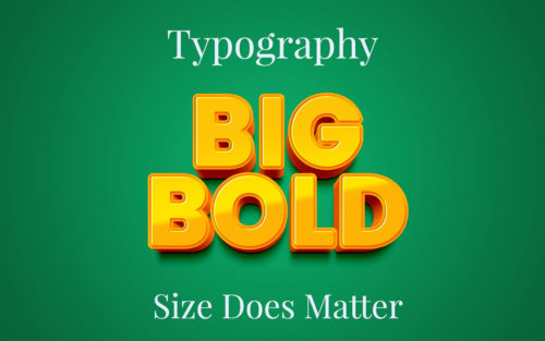
What is Big and bold typography?
Using font size bigger than regular actually considered as Big and bold typography. Let’s check below font sizes for oversized lettering.
- Headers — 30+ pt
- Banners — 50+ pt
- Body Text — 18+ pt
- Call to Action — 30+ pt
Why use big type in web design?
If you wonder why you even have to think about oversized lettering, Well, People naturally look at a headline first, and if they become interested, they will look through the rest of the content. A larger bold text is easier to read and definitely draw the visitors’ attention and make them settle on your website. This means that users will be more likely to stop and read, instead of simply scrolling your webpage. As a result, there will be more opportunity for your CTA works. Big and bold typography will keep users interested and engaged throughout their time on your website.
Big & Bold Typography in web design
If you want to make sure your website looks stunning, and effective, with larger text, here are some key tips:
- White Space: increase the space around your text to match. Between letters and between lines is critical to making your larger text successful. With not enough space between and around words, the words can be difficult to distinguish, especially by a user who is just scanning your website.
- Use Few Fonts: Strong visual typography uses a limited number of font families, and no more fonts within them than necessary. Most experienced designers agree that a practical limit for font families is two or three.
- Hierarchy: Establishing logical hierarchies is one of the most important functions of type. Hierarchy in web design is the act of making the most important feature the largest, and to rank the next features by size too. It’s helps users to identify the priority order for reading and understanding. So if you increase the size of your body text, you need to make sure you scale up other headings and pieces of text to match. You might also need to consider the size of your captions.
- Choose Perfect Font: Unfortunately, not all fonts can be scaled to 150px and still look good. the font you choose will determine the readability of the text. So choose a simple font, with a regular stroke width and clean lines to make sure your content will be legible.
Best Bold Fonts
Unfortunately, not all fonts can be scaled to 150px and still look good. Below is link of Free Bold fonts that look great at scale and that are sure to get your creative juices flowing.
Best Free Bold Fonts: Click Here